Reflex Medical Centre, located in Mississauga, Ontario, Canada, is a brand new state-of-the-art facility which houses all of your health care needs under one roof. The facility had recently been open with some construction still going on when I was commissioned to design a brand new website that would help capture that same feeling of amazement when you walked into the building.
I was originally hired to handle some of the marketing and print material for Reflex when they reached out to me to come on board and help with their website. The project was already underway but the client felt that it was lacking visually. At this point the budget only allowed for a new desktop design that their developer would then take and dissect in order to make responsive.
In order to successfully build any website it is imperative to understand your demographic. With the help of Marie Helou-Tawfik, Project Manager, and Tarek Tawfik, Advisor, we determined that Reflex Medical Centre’s demographic could range from the ages of 19 to 85+ and be both male and female. It was a fairly large demographic based on all the service Reflex offers. However, we knew we needed to design the website for the elderly because if we could accommodate their needs, we could cover most, if not all, of the younger people’s needs as well.
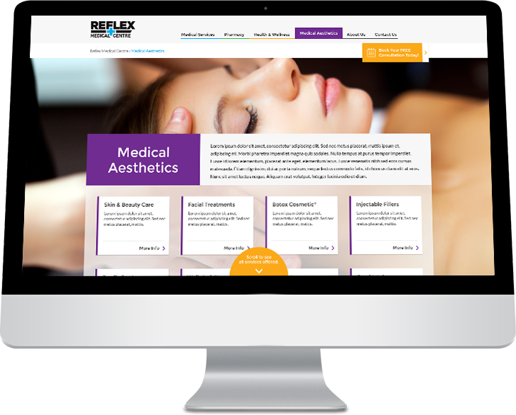
For this reason design decisions like using a large readable black font on a white background and clear legible headers were made. Colour coordinated sections were also used to help visitors keep track of which branch of services they were viewing as they dove deeper into the website. For example, Medical Services were represented by blue, Aesthetic services by purple and Pharmacy services by green. We also used animated indicators to let visitors know that there was more content off screen or below the fold.
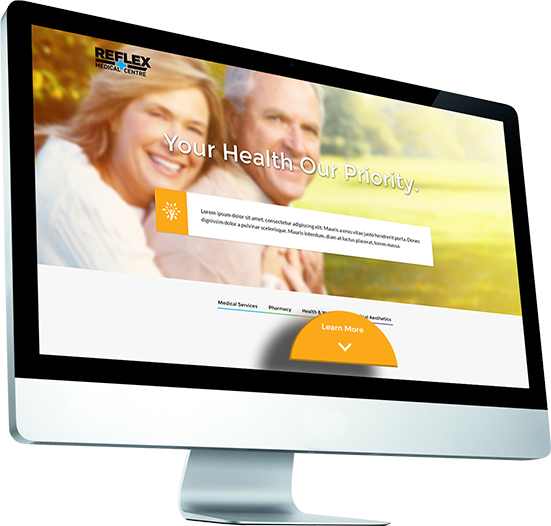
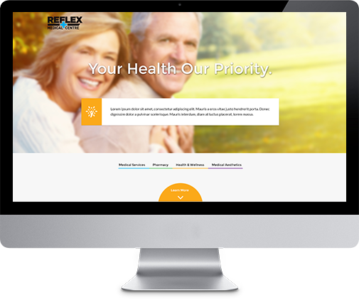
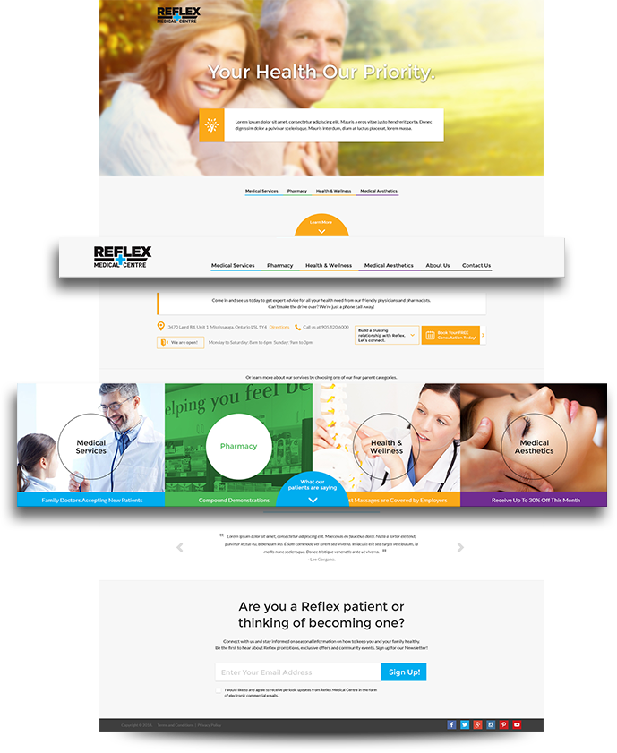
Once the design decisions were made to suit our demographic the next thing that needed to be accomplished was to establish a great first impression when a visitor first lands on Reflex Medical Centre’s website. While doing that, educating visitors on how Reflex Medical Centre was different from your average Doctor’s office was also crucial. I decided to go with a full splash landing take-over with a powerful slogan which Tarek had created, “Your Health, Our Priority”. Accompanying that would be a short introduction about Reflex and then below that the 4 main categories of services would be listed. These 4 categories would then stick to the top of the page on scroll and act as the main menu with new links of “About Us” and “Contact Us” fading in.
This main landing area would be dynamic and the content would be responsive. The message and image would be altered for returning visitors so that Reflex could push any promotional items they had going on at the time. There was no need to introduce Reflex Medical Centre over and over again every time someone visited the website.
The demographic also determined that most visitors were visiting Reflex’s website in order to find operating hours, contact information and directions. This information was placed immediately after the landing area so that it would be found quickly and easily.
Another integral part of the home page design was having the 4 main sections of services easily identifiable and if it wasn’t accomplished through the website’s main navigation, fairly large sized boxes were placed after the hours of operation, contact information and directions to accomplish this goal.
 Once a visitor selects one of the 4 main sections of services they would be brought to an overview page that would break down the available services even further. By utilizing a card design, each service was easy to find and visitors could read brief excerpt about that service.
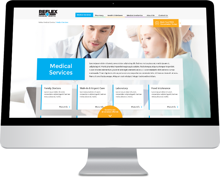
It was important for the visitor not to get lost in the website as they dove deeper into it. Once a visitor selected a service there was a large blue (depending on which section they were in) button that let them know they could go back to view all the services. I wanted to save the visitor some time though, so I decided to place next and previous service buttons to the left and right of the website that would stick. They could use these buttons to go through all the services without having to go back to the main overview page.
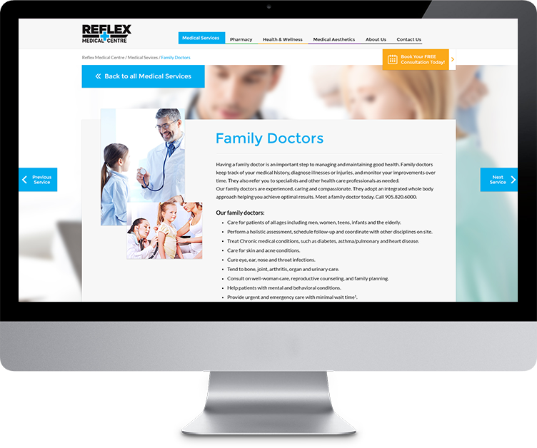
If a visitor found a service that was right for them, they could use the large yellow button that sticks to the main header to quickly book their appointment.
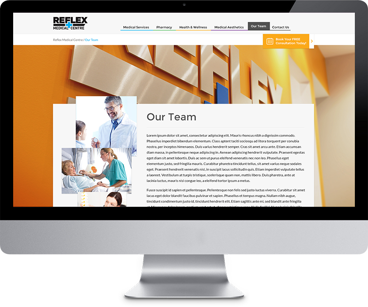
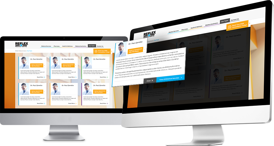
The design of the Team page was to help convey how the Doctors, Nurses, and other staff members at Reflex Medical Centre specialized in certain areas while being diverse, so you could get the best possible care for whatever was ailing you. A visitor could view information about a Doctor, Nurse or staff member so they would feel comfortable knowing about them when they arrived to the centre. Visitors could also use this page to request an appointment with that specific Doctor. Again, a card design was utilized here to help with the organization of all the information. Whenever the user clicked on a staff member that information was brought to the forefront while everything else hid in the background.
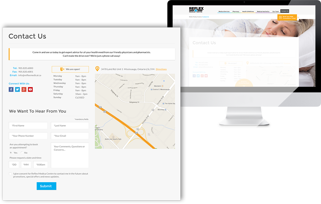
The Contact Us page design had every piece of information the visitor would need in order to make an appointment with or without a specific Doctor, inquire about any of the services Reflex offers, find the centre’s hours of operation and get directions to the centre.
