Designing an e-commerce website with over 3,000 products can be quite intimidating. You want to make sure shoppers can find products with ease. You also want to encourage add-on sales while making the check-out process quick and easy. No matter how much you prepare for a website of this size there is always a lot of unknown going into it. This is what made this project a lot of fun to work on.
Developed by Marcin Brzuzy
When I got word that I had successfully landed the AAA Vacuum website re-design, I was thrilled. The initial meetings with the client went extremely well. They gave me a small list of things they wanted to see in the new website and were eager to see what other enhancements I could bring to the table. I began creating wireframes that were a little more detailed than your average wireframes. I find this process makes the transition into the design stage easier, while still allowing for quick revisions to the wireframes if necessary.
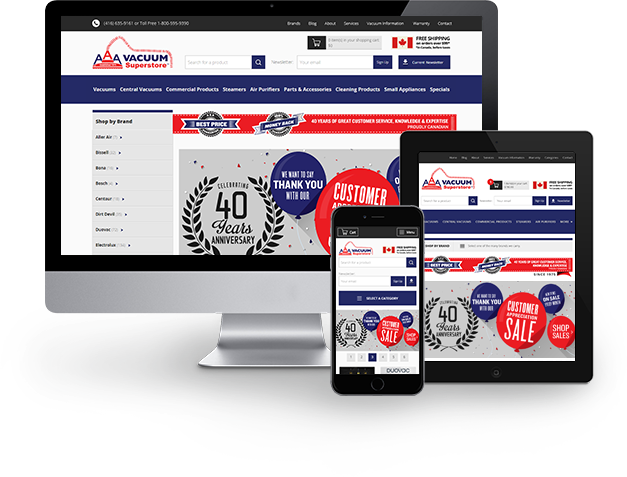
Wireframes were created at various screen resolutions to illustrate to the client and developer how elements would be affected based on viewport size.
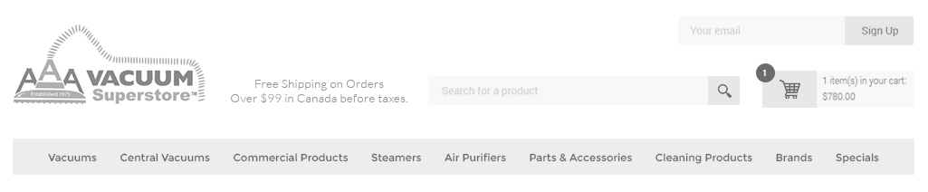
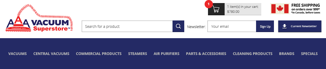
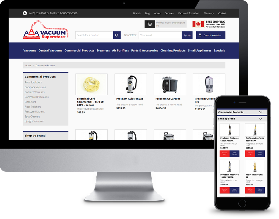
Once the client, developer and myself were happy with the wireframes we had a solid foundation to start designing around. The header was a crucial part of the website so I started there. From the header, shoppers can browse through AAA Vacuums’ main categories, search for a product, subscribe to the AAA Vacuum newsletter, download the latest newsletter, and see what products are in their cart. These options and features were organized in an interface that was clean and easy to navigate.
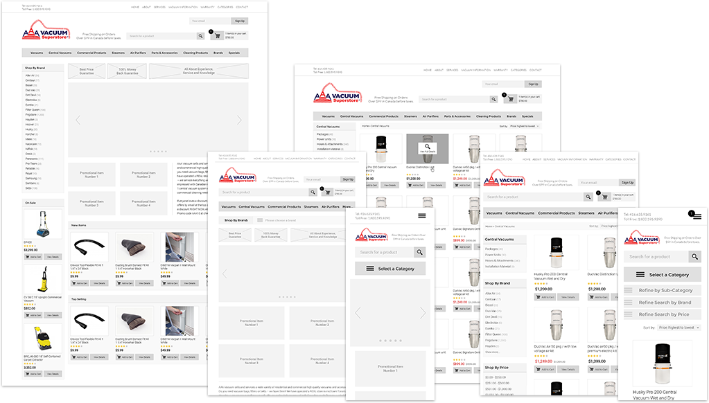
One of the client’s early request was that the home page have a side bar to the left that displayed all of the brands they carry. Shoppers who are looking for a specific part will see this bar and scroll down until they see the manufacturer they’re looking for. We also thought it would be a good opportunity to push promotions and important items on the right hand side of this area on the home page as shoppers scrolled down. A slider area was created with multiple graphics, one being the announcement of AAA Vacuums’ 40 year anniversary. Once past all the promotional graphics, I wanted to get right into the products and allow visitors to begin shopping, even if they haven’t clicked anywhere at this point.
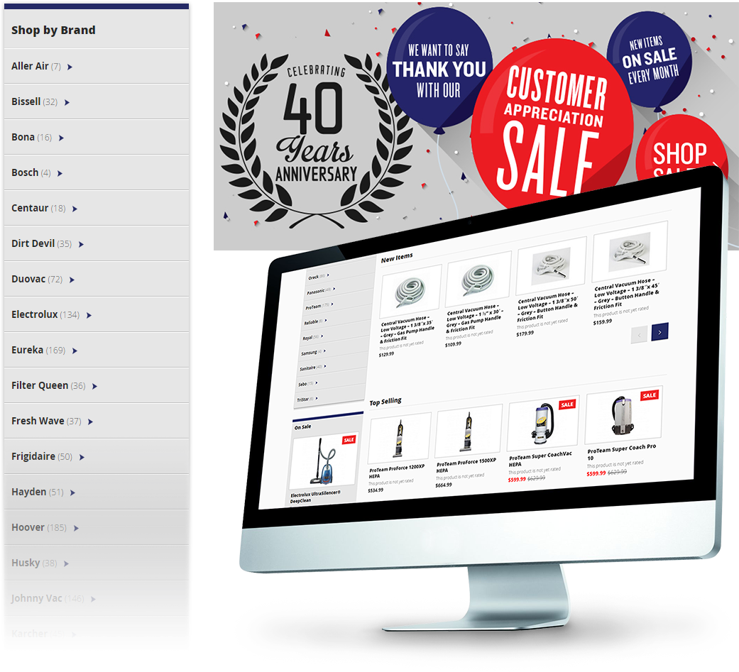
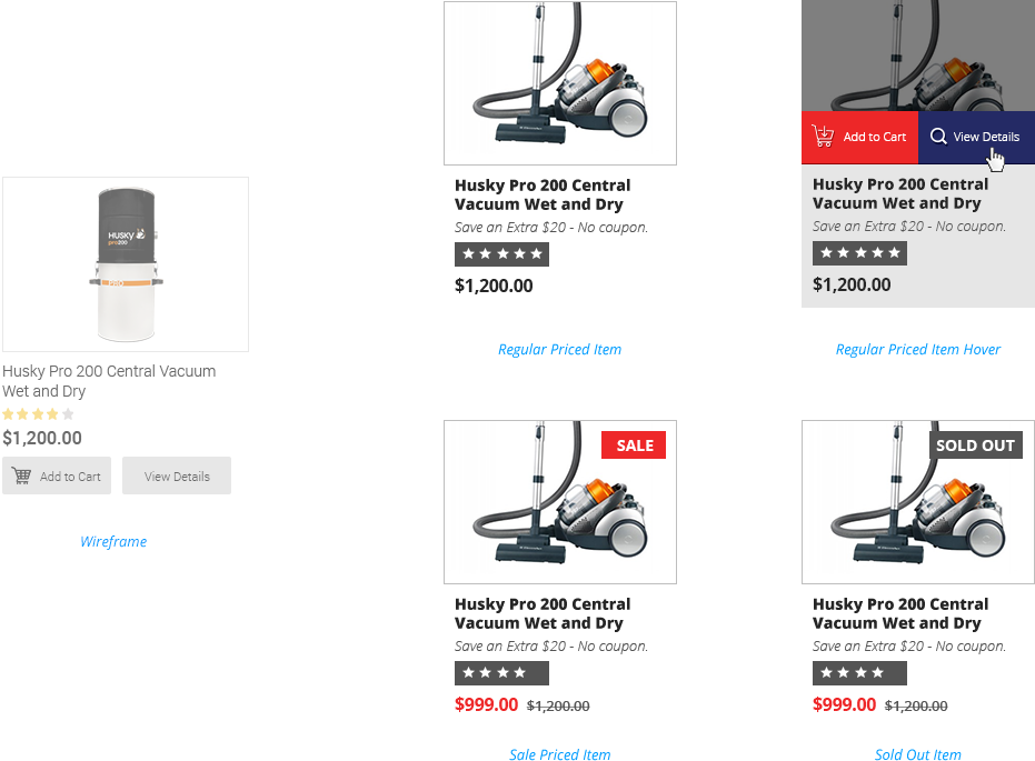
A lot of thought went into designing the interface for the products. Another one of the client’s requests was to have continuous scrolling whenever a shoppers was scrolling through all the product results. At the same time, it was important to allow shoppers to check-out quickly so we wanted a quick “Add to Cart” button accessible without having to click into the product itself. My original wireframe included an “Add to Cart” button as well as a “View Details” button that were visible at all times. When using this method with continuous scrolling, I found that the buttons took up too much real-estate on the page. Because of this, I altered my design and did a reveal on hover for the “Add to Cart” and “View Details” button. On tablet and mobile devices I decided to go back to having the buttons displayed at all times.
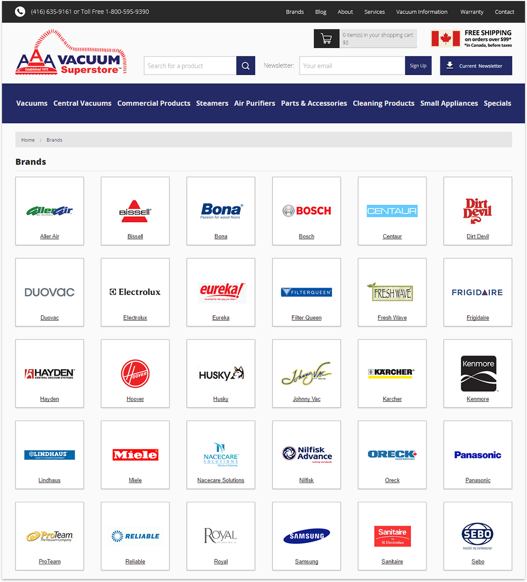
When shoppers click on the brands page, they are taken to a page that lays out all of AAA Vacuum’s trusted brands in tiles. Shoppers can click through a brand to browse all of their available products.
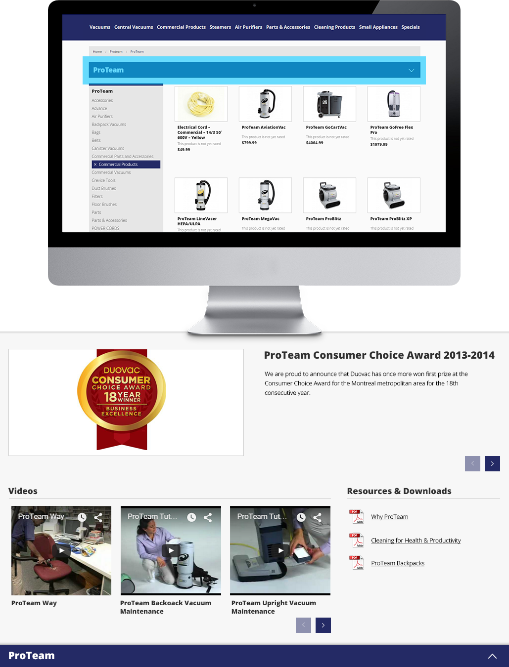
While working on this project with AAA Vacuum, I came to realize that the client always runs into the scenario where they want to upload various content that belongs to a specific supplier of theirs. Trying to allow for future unknown content while keeping the overall website organized was challenging. I wanted to build something fluid that would work well for a brand that had a lot of unique content, and work just as well for a brand that had no unique content.
The solution was this drawer that appears at the top of every catalog page designated to a specific brand. On page load, the drawer would start in its open state. The drawer’s content allows for a carousel (image and text), videos, and files that visitors can download. After a couple seconds the drawer slides up and closes. This tells shoppers that the drawer exists and there’s more content available to them without getting in the way of their shopping experience.
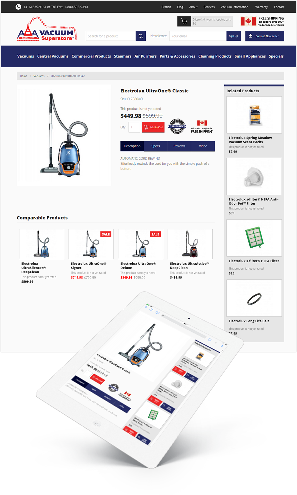
The shoppers who already know all about the product they’re looking for may be inclined to use the quick “Add to Cart” button, but for those who want to know more, the product page is crucial. Essential product information such as product name, sku, price, description, and specifications are displayed in a clean and easy-to-find interface. Shoppers can also review a product they purchased and read other customer’s reviews. The option to upload a video about that product is also made available to AAA Vacuum.
To increase sales and push add-on items, the right column of this page would display related products. If a shopper is looking for a particular vacuum, they can find the bags or filters that go with that vacuum on the right hand side. Comparable items are listed below in the case they were looking to save a little bit of money or spend a bit more for something slightly better. If these items are not populated, the fall back is to display sale items on the right hand side and items within the same category below.
Thank you for watching and be sure to check out the live site at:
www.aaavacuum.ca